
TYPE
YEAR
CATEGORY
MODEL
Project overview
For Relic, StudioDraft® developed the brand strategy, positioning, archetypes, verbal identity and visual identity. We also created the typography, graphic system, layouts, brand applications and overall identity system.
A good name should earn its keep.
You can call a brand almost anything.
Apple sells computers. Dove sells soap. Penguin sells books.
The name does not always have to explain the product.


But if you happen to call a streetwear brand Relic, it would be a shame not to use it
because a relic already comes with baggage. The useful kind.
It is old. Rare. Worn by time. Kept because it means something. Sometimes sacred. Sometimes mythical. Almost always worth holding on to.

Relic could borrow from the past without looking like it belonged there.
Mythology gave us symbols. Ancient objects gave us texture. The idea of preservation gave the clothes permanence.
And then there was the nicest contradiction of all.
A relic is something worn by time.


Relic was something you could wear out.
That thought started finding its way into everything.
The brand became part artefact, part streetwear label.
Old imagery met brutalist layouts. Frayed edges sat beside rigid grids.
Things that looked discovered were treated like things newly made.


The personality came from the same place.
We built Relic around two archetypes: The Creator and The Rebel.
The Creator gave the brand its obsession with making,
craft and objects worth keeping.
The Outlaw made sure none of it became too holy.


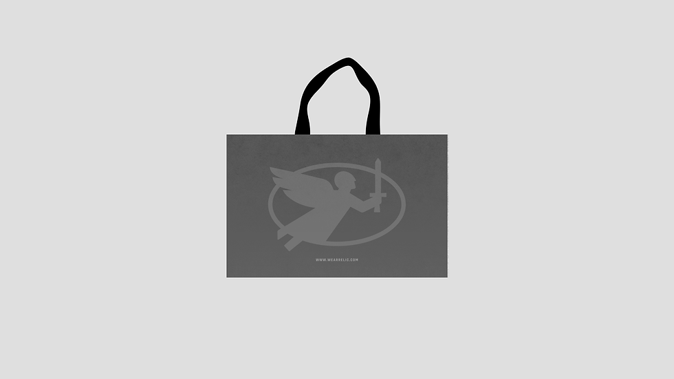
Which is how we ended up with an angel carrying a sword.
An angel on its own would have been predictable.
The sword made it Relic.


And that, really, is the advantage of a name with something inside it.
You do not have to invent a story from scratch.
Sometimes you just have to notice the one you have already been given.


