
TYPE
YEAR
CATEGORY
MODEL
Project overview
For Doto, we created the brand strategy, positioning, verbal identity, visual identity and packaging. The identity was built around the idea that one brand can hold many sides of the same woman.
Can your brand have multiple personalities?
Yes.
Your customers already do.
The person who walks into an office at 9:30 in the morning is rarely quite the same person having dinner with her friends at 9:30 that night.
At work, she may be organised, articulate and terribly good at replying to emails she would rather ignore. With her friends, considerably less so. At home, she is someone else again.
Put a padel racket in her hand on Sunday morning and there is another version altogether.
None of this makes her inconsistent.
It makes her a person.


Yet brands are often given the opposite advice.
Pick a personality. Define it carefully. Stay in character.
There is good sense in that. A brand that changes its mind every five minutes is difficult to recognise. But consistency and sameness are two very different things.
People have range.
Good brands can have it too.
The trick is making sure every version still feels like the same person.
That became particularly relevant when we started working on Doto.

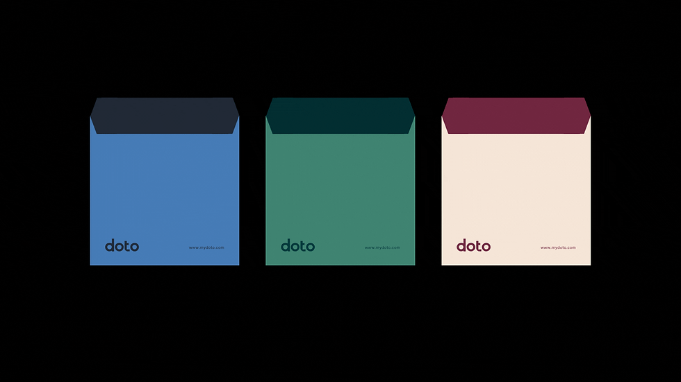
Doto is a contemporary accessories brand made for women moving between professional, personal, social and emotional lives, often within the space of a single day.
The idea at the centre of the brand became, For all she is.
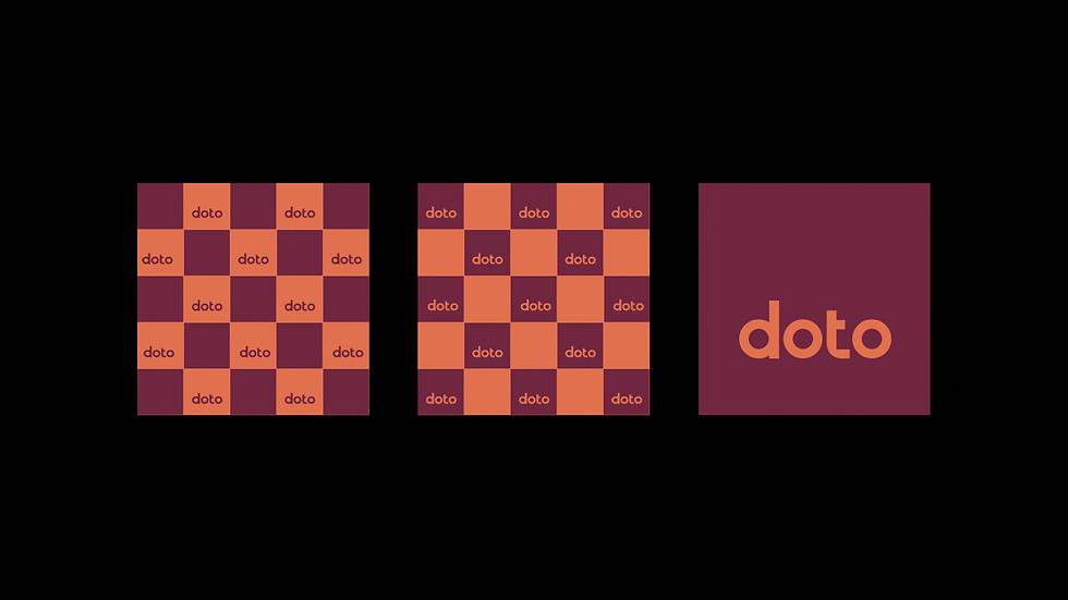

Because a bag has an unusually demanding job.
It may leave home with you for a meeting in the morning, sit beside you through lunch, follow you across town and still be there when somebody decides the evening should continue somewhere else.
You should not have to become a different person to suit the bag.
The bag should be able to keep up with you.
So rather than giving Doto one rigid personality, we built the brand around contrast.
Refined could sit beside playful. Structure could live with softness. Confidence did not have to mean severity. Elegance did not have to spend the entire day behaving itself.


That idea shaped the verbal and visual identity together. The wordmark was designed to feel playful yet refined, while the wider system balanced typography, colour and layout in a way that could adapt across packaging, digital, retail and communication without losing the character of the brand.
The language followed the same principle. Intelligent without becoming formal. Honest without becoming earnest.
Fashion conscious without falling into the usual fashion clichés.
Which is perhaps the more useful lesson here.
Your brand does not need one personality.
It needs one recognisable character with enough personality to have more than one side.
After all, your audience manages it every day.


