

TYPE
YEAR
CATEGORY
MODEL
Project overview
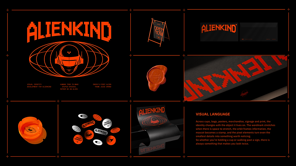
AlienKind came to us to create the identity for Bengaluru’s alien-themed juice brand. We developed the mascot, logo system and the visual language. The identity was designed to stretch across packaging, communication and physical spaces.
A brief history of leaving Earth.
Without actually leaving the world.
AlienKind came to us with a fairly simple brief: make it feel out of this world.
Naturally, we took that quite literally. We like to please our clients.
The first place we went was the mascot.
We drew aliens.
Then we drew stranger aliens.
Then stranger ones still. At one point,
we had made the character so alien that even we could barely tell what we were looking at.
Technically, we had done the job.
There was only one problem.
Nobody cares about something they cannot connect with.
That became the more interesting question for us.


How do you make something feel like it comes from another world without making it feel so foreign that people simply walk past it?
So we came back to Earth a little.
The mascot became more human in form. Familiar enough to recognise a face, a body, a smile, an attitude. Strange enough to make you wonder what exactly you were looking at.
The headgear, the expression, the details around the character all became little clues rather than one giant sign screaming ALIEN.
It looked a bit like us.
Just enough to make you ask where it came from.
And that, really, became the principle behind the rest of AlienKind.
Because intrigue works better than explanation.
Once the character gave us a way into the world,
we could start making the world around it.

The identity became loud, bright and impossible to casually overlook.
The stores took on that same energy.
The language followed. Even the menu speaks the same language: Galactic Smoothies, Celestial Juices, Starship Burgers.
The brand today describes its own philosophy as “Humans Make Stupid Choices, Rather Be an Alien,” while its environments have been described as a kind of futuristic brutalism.


There is no shortage of very good products in the world. There is good coffee everywhere. Good burgers everywhere. Good juice everywhere.
In AlienKind’s case, the product had already given us something worth building around. The job of the brand was to make sure people noticed it long enough to discover that.
Branding cannot rescue a bad product.
A great product can, however, remain remarkably easy to ignore.
So the work was never just about making AlienKind look unusual.
It was about creating enough curiosity for somebody to stop, look again,
walk in, order something and eventually tell somebody else about it.
You can see that principle in the physical experience too.
The original Indiranagar location leaned hard into the orange-red world, the alien character and lines like “Welcome to the other side.” AlienKind has since expanded beyond that first Bengaluru store into multiple locations, with a Delhi launch in 2026 and further expansion underway.
Everybody wants to make something out of this world.
The harder job is making people in this world care about it.
We never actually had to leave Earth.
We just had to make somewhere people wanted to go.
That is how you make something out of this world.


