
TYPE
YEAR
CATEGORY
MODEL
Project overview
POVA® came to us for a complete rebrand and we made it around: Built for what’s next. We created the strategy, positioning, verbal and visual identity, UI, digital applications and retail store design. The result is a more distinctive, connected brand with one clear idea running through every part of the business.
We rebranded POVA.
We kept the logo.
Which sounds a little strange.
Because somewhere along the way, rebranding became shorthand for changing your logo.
New symbol. New font. New colour. Big reveal on Instagram.
Everyone claps.
Brand successfully rebranded.
Except, of course, that is not really how it works.
POVA® came to us because the brand was saying many things.
Looking many ways.
Talking about gaming here, performance there, specifications somewhere else.
Some of it worked.
Some of it did not.
The bigger problem was that nobody could quite tell you what connected all of it.
There was a brand.
There just wasn’t enough of a system.
And interestingly, the logo was perfectly fine.
So we left it alone.


People do more than one thing with their phones.
They shoot.
Edit.
Play.
Work.
Scroll for three hours and then complain that they have no time.
The point was not to walk away from performance.
It was to make performance mean more.
POVA® is for people who wanted technology that could keep up.
With whatever they were doing now.
And whatever they decided to do ten minutes later.
That gave us the thought that would hold the brand together.
Built for what’s next.


Once you know what you stand for,
things get easier.
The personality became clearer too.
POVA® became part Outlaw, part Creator.
The Outlaw because the brand was never trying to be the most obvious phone in the room.
It could challenge the assumption that the biggest, most familiar name was automatically the smartest choice.
The Creator because the product was made for people who actually use technology.
To make things.
Try things.
Break things.
Build them again.
The two worked rather nicely together.
One questions the usual answer.
The other makes a better one.


Then came the part everyone usually calls the rebrand.
The colours changed.
The typography changed.
The layouts changed.
The graphic system changed.
The language changed.
The digital experience changed.
The logo did not.
And somehow, the brand looked more different than it would have if we had simply drawn another logo.
The colour system became sharper.
Orange came in as an accent and immediately gave the brand more energy and recognition.
Typography stopped being something that merely carried words and became part of the identity itself.
The layouts became more deliberate.
The visual language became more ownable.
The details became specific enough that even when POVA® was not shouting its name at you, it could still feel like POVA®.
Which is usually a good test of whether an identity is doing its job.


The words needed a rebrand too.
Phones have a habit of talking like instruction manuals.
Numbers.
Processors.
Refresh rates.
Battery sizes.
Many impressive things that normal people rarely say to one another over lunch.
POVA® needed to talk about what all that technology actually allowed someone to do.
So the verbal identity became bolder.
More direct.
More confident.
Less interested in sounding like every other technology brand explaining why its newest phone was its fastest phone ever.
The product specifications were still important.
They simply had somewhere to go now.
Every message could return to the same idea.
This is technology made for what comes next.


And that is probably the real point of a rebrand.
And that is probably the real point of a rebrand.
It should make future decisions easier.
When a new product launches, the brand should already know how to talk about it.
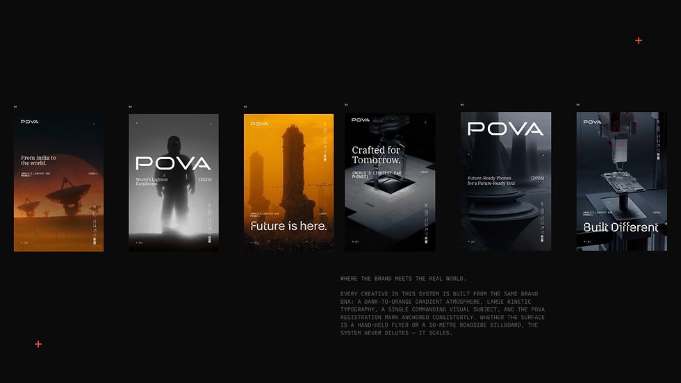
When someone designs a billboard, they should not have to invent POVA® again.
When a social team makes a post, a designer builds a page or an agency creates a campaign, everyone should be working from the same world.
That is what a brand system gives you.
Not a prettier folder of assets.
A way to grow without becoming ten different brands on the way there.
For POVA®, the strategy, language, visual identity and digital experience finally had one idea running through them.
Built for what’s next.



So yes,
we rebranded POVA.
Strategy changed.
Positioning changed.
Language changed.
Colour changed.
Typography changed.
The visual system changed.
The way the brand could grow changed.
The logo stayed exactly where it was.
Because sometimes rebranding is about knowing what to change.
And sometimes it is about being smart enough to know what not to.
POVA®.
Built for what’s next.


