
+++
In 2024, PMX Healthcare, a longevity clinic operating in the competitive healthcare sector, engaged us to help them forge a unique and compelling brand identity. While they possessed an existing brand system, it was fundamentally underperforming; their brand guide was overly complex and difficult to implement, and crucially, their color system lacked any sense of unity, resulting in inconsistent and diluted visual communications across various touch points.
Project Details
We did a complete Brand Refresh for PMX Healthcare brand. The project involved logo optimisation, the creation of a unified color palette, and the development of a robust brand strategy, verbal identity, and visual system.
Type
Year
Category
Model
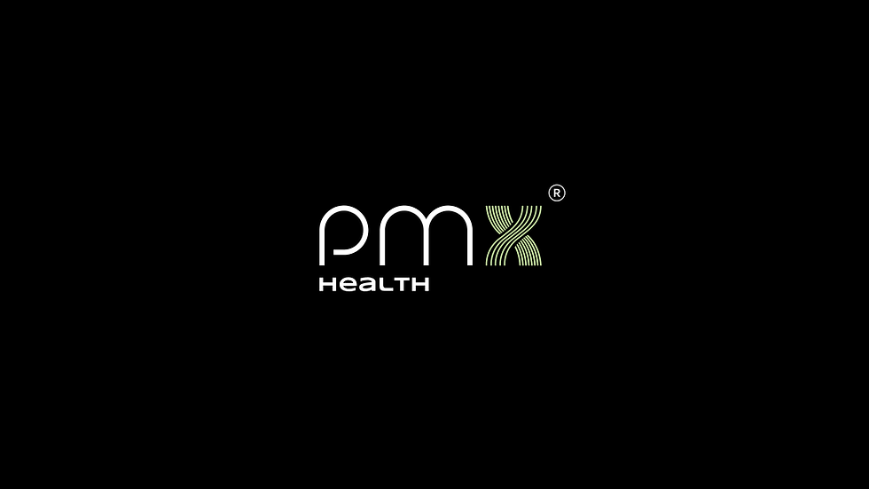
The most critical issues, however, lay with their logo. The wordmark was not merely aesthetically unappealing but suffered from significant legibility problems, often becoming indistinct and failing completely in smaller or more demanding applications. A major structural flaw was the disconnect between the icon and the wordmark, which existed as separate entities rather than a unified brand signature.

Our intervention began with a strategic overhaul: we merged the icon and wordmark into a single, cohesive lockup to create a powerful and unforgettable visual anchor. From there, we meticulously optimized the distinctive stripes within the "X" icon, refining them for maximum clarity and scalability, and we completely redesigned the letter "p" in the wordmark to ensure it remained crisp, clear, and instantly recognizable across all media, from digital screens to large-format signage.

This foundational work was part of a much broader transformation. We introduced a sophisticated new typography system, implementing a strict hierarchy to bring order and enhance the readability of all their communications. Simultaneously, we decoded and unified their color system, developing a cohesive palette that is not only visually harmonious but strategically aligned with PMX’s core brand goals and vision, evoking the trust and professionalism essential in healthcare.

This visual execution was driven by a comprehensive new brand strategy, specifically tailored to the healthcare landscape, which involved repositioning PMX to effectively communicate with its target audience and redefining the brand’s verbal identity and tone of voice to ensure every message carried the right weight and personality.

The culmination of this work is a holistic brand refresh where every element from the unified logo and strategic color palette to the typographic hierarchy and verbal identity, works in concert to create a visual language that genuinely resonates with their customers.
The project’s legacy is a robust and intuitive brand guide that serves as a complete system, governing all brand applications and touchpoints with precision, and ultimately empowering PMX Healthcare to stand out distinctly from its competitors with a cohesive, professional, and memorable brand presence.
