StudioDraft® developed a complete rebranding for Ludic, a footwear-focused lifestyle brand based in Ahmedabad, India, to refine and unify its identity. The goal was to create a cohesive brand system that strengthens both its verbal and visual, ensuring every brand touchpoint consistently reflects its core values and aesthetic.
Project Details
Started in 2024, we conducted a comprehensive brand audit and research, followed by verbal identity, brand strategy, and visual identity development, creating a complete brand system across all touch points, along with campaign design and guidelines.
Type
Year
Category
Model

Starting in 2024, we began Ludic’s transformation with an in-depth brand audit and research, identifying key gaps in its existing visual and verbal systems—most notably unclear positioning and a lack of distinct identity. The brand struggled to stand out, which led us to strategically reposition Ludic as India’s footwear-first lifestyle brand. Rooted in the belief that fashion should never be one-size-fits-all, Ludic was built on a simple yet powerful idea: to challenge the norm and create products that truly reflect Indian style, fit, and individuality.
We developed a refined verbal identity that clearly communicates the brand’s archetype, tone, and attitude, bold, relatable, and expressive. This was supported by a cohesive visual identity system designed to bring consistency and recognition across all touchpoints. By aligning strategy, storytelling, and design, we crafted a brand that not only fills a significant gap in the Indian market but also stands for quality, comfort, and a distinct sense of self-expression.

Building on this foundation, the visual identity focused on optimizing and redefining the logo system. The previous symbol leaned too feminine and failed to express the brand’s playful, bold character, prompting us to develop a new favicon concept that goes beyond a functional icon to become a flexible asset across all brand applications. At the core of this system, we introduced a dual asterisk symbol in two distinct styles, designed to act as a playful and dynamic element throughout the identity.

While evolving the system, we retained value from the existing brand by reinterpreting the previous symbol in a more abstract manner, integrating it subtly into product detailing and stitch patterns. Alongside this, we refined the brand’s primary red, carefully calibrating a shade that performs consistently across both print and digital mediums, ensuring the color remains a strong, reliable anchor within the overall brand system.

Following this, we developed a range of print and digital collaterals aligned with the new visual system, ensuring consistency across all touchpoints. The primary red was made more prominent, while a refined accent palette was introduced to complement and support the brand’s product colorways.
We further expanded the brand into a comprehensive system, developing packaging, emailers, pricing cards, UI interfaces, lookbooks, document layouts, and tech packs—all designed to function seamlessly within a unified and scalable brand language.

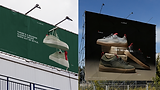
After completing the brand revamp, we designed and developed a brand campaign for Ludic, built on the new visual language and aligned with the refined verbal tone. This brought a stronger and more consistent brand presence across all campaigns and advertising touchpoints. With the new identity in place, Ludic was able to reposition itself effectively, resulting in improved brand reach, stronger recall, and a noticeable impact on both sales and overall brand awareness.
In conclusion, the transformation positioned Ludic as a clear, confident, and future-ready footwear-first lifestyle brand, equipped with a cohesive system to scale consistently across every touchpoint.